

Back to the Columbia River Gorge! This time to the famous Punchbowl falls, a serene 30-foot drop over what looks to be the lips of a cup and pouring gracefully into a calm circular pool of green water - or at least that's the impression I got from the pictures online.
 |
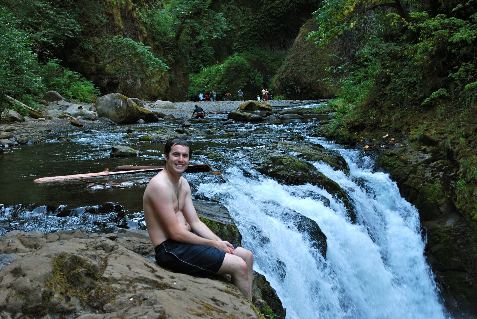
| Me swimming at the base of Punchbowl Falls (photo by Courtney) |
In fact I found the falls to be less peaceful than Google Images had led me to believe. As I've mentioned before, waterfall photography tells lies through high shutter speed to remove movement speed from waterfalls and add silky body; looking at a picture like the first on this post one would expect the falls to sound like a loud trickle with the light sprinkles of a fountain. This was not the case with Punchbowl Falls - this waterfall roared. There was nothing gentle in its plunge, both because of the high volume of water jumping over the ledge each second and because the basin it fell into amplified the sound.

I felt it to be a working class waterfall, diligently throwing water below without much concern for visual beauty or grace. There are only a couple places where one can photograph Punchbowl Falls and I felt like it struggled against my efforts to find new ways to capture it with the camera, as if it were aching to go back to work and my enjoyment was preventing that. It was a hardworking waterfall. Courtney, on the other hand, thought it was nurturing - the cove carved out at the base of the falls was so secluded that she felt like the waterfall was wrapping around her in an embrace (my words, not hers). I bet we're each right.

Punchbowl Falls helped me to realized a very important aspect of Columbia River Gorge waterfalls: the color. The Gorge's lush greenness provides a real challenge when I think about photographing waterfalls there: How can I encapsulate how vibrant the waterfall's environment is without sacrificing the grandeur of the waterfall itself? In my pictures I like the waterfall to be central to the photo's composition, unlike in this excellent photo blog where the waterfalls are usually seen as a part of the background or a larger landscape. I've usually used shapes to bring out the waterfall in composition, but in the Columbia River Gorge color is an effective method as well, and the two can compliment each other.


For example, compare the two pictures above; they're actually the same exact shot, just copied and put into black and white. The photo works well in black and white, but it loses the deep green grass above the top of the falls. In the black and white photo the eye naturally drifts down with the path of the waterfall, but in the color photo the eye stays towards the top of the falls, attracted to the green. Personally I find the color picture more exciting because the geometry of the falls' top more interesting than its base.
However, in the three pictures below, I am most drawn to the sepia because it draws emphasis away from the green-leaved tree and back towards the waterfall, moving your eye in the shape of an L along the river without pulling it back up the tree as strongly. The black and white photo has a similar effect although I personally feel it weakens the definition.


The final note about Punchbowl Falls: its swimability. The water is from snow melt so it was fairly cold, even in the heat of late August. Still, I swam out to the base of the waterfall, plus I jumped off the top of the shorter Lower Punchbowl Falls (all photos by Courtney):


No comments:
Post a Comment
Comments